The number of people infected with the Omicron variant of COVID-19 is increasing at a rate that we have not seen before. The NY Times has created and updates a database of vital statistics related to the COVID-19 pandemic and makes this data available to the public. Their latest graphs are available on their news site. They also make this data available for free, non-commercial use subject to their license. Below we display two graphs made from their data.
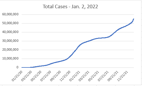
The first graph shows how many total cases have been officially reported. This number is undoubtedly an undercount since there are asymptomatic people and people with mild symptoms who would not be counted in such a survey. Two things to note here are:
- the “official count” will soon exceed 60 million people
- there is a very worrisome increase in the slope of the curve because of the increased infectiousness of Omicron.
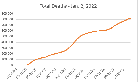
The second graph shows the number of deaths attributed to COVID-19. The number as of January 2, 2022, is about 820,000 people. Typically deaths lag infections by several weeks and we can only hope that Omicron will not be as deadly as earlier variants because if the death rate follows the infection curve, there will be very many additional deaths.
January 2, 2022
